Perceptrons were one of the earliest supervised learning models, and though they went out of fashion for about 50 years, they’ve more recently experienced a huge comeback in the form of multi-layer perceptrons, also known as neural networks. You may have heard about how neural networks can now perform all kinds of marvelous and perhaps unsettling feats, such as recognising speech, captioning images and beating humans at games. But they are surrounded by an unfortunate aura of mystery and magic, and I sometimes hear people complain that the study of neural networks lacks sound theoretical foundations. To debunk this idea, I’ll explore some visualisations of what a perceptron “sees” when it makes a decision, which will help us understand why chaining together multiple layers of perceptrons is such an effective technique.
First, some background: a perceptron is a type of linear model that learns a decision boundary by averaging together data points until it reaches a stable solution. I’ll only be considering perceptrons with two input nodes, but the intuition we’ll develop applies equally well to higher dimensional data, although it becomes substantially trickier to visualise. For our purposes, a trained perceptron is a function of an input vector that produces a prediction , between 0 and 1. You will usually see this function written as where is the sigmoid activation function, is a vector of weights connecting units in the network, is the input vector (the data) and is a bias term. However, the bias won’t qualitatively change the following visualisations so I am going to set all biases to 0 to keep things simple. So, in the 2 input case this breaks down as Essentially, a perceptron takes a weighted average of its input nodes and then computes the sigmoid of the result, yielding a result between 0 and 1. Why the sigmoid? This may seem mysterious and arbitrary to you right now, but we are going to pry open the black box to see why the sigmoid works as an activation function.
We’ll be thinking about the perceptron as a classifer, which means that we use the output of the perceptron to partition the input space into two classes, class #0 and class #1. The line between the classes is the decision boundary, and it corresponds to a contour (line of constant value) of the perceptron function, typically something like = 0.5.
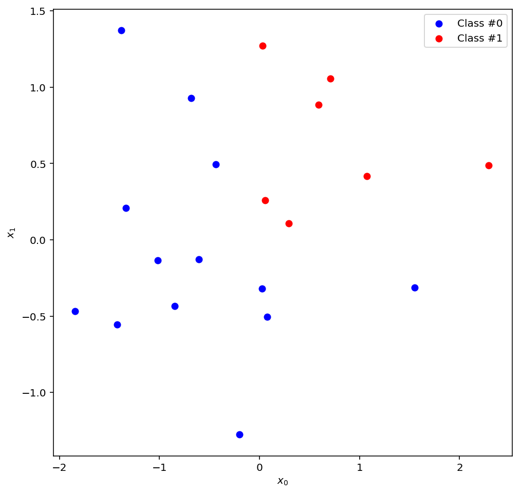
Ok, enough with the small talk, let’s start visualising stuff! This is our data, the ground truth that our model will try to learn:
import matplotlib
%matplotlib inline
%config InlineBackend.figure_format = 'retina'
import matplotlib.pyplot as plt
import numpy as np

np.random.seed(40)
data = np.random.normal(size=40).reshape((-1, 2))

label = np.apply_along_axis(lambda x: 1 if x[0] > 0 and x[1] > 0 else 0, 1, data)
data_0 = data[label == 0]
data_1 = data[label == 1]

fig = plt.figure(figsize=(8,8))
ax = plt.axes()
ax.scatter(data_0[:, 0], data_0[:, 1], c='b', label='Class #0')
ax.scatter(data_1[:, 0], data_1[:, 1], c='r', label='Class #1')
ax.set_xlabel("$x_0$")
ax.set_ylabel("$x_1$")
ax.legend()
And here is our neural network:

It has 2 inputs, 1 output, and a hidden layer with 2 perceptron units in the middle. And here are the two decision boundaries that the hidden layer perceptrons have found:
def sigmoid(x):
    return 1. / (1. + np.exp(-x))

def perceptron(weights, x):
    return sigmoid(np.dot(weights, x))

def decision_boundary(weights, x0):
    return -1. * weights[0]/weights[1] * x0

w0 = np.array([10, -1])
w1 = np.array([-1, 10])

t0 = np.linspace(-0.2, 0.2, num=50)
t1 = np.linspace(-2.5, 2.5, num=50)

fig = plt.figure(figsize=(8,8))

ax = plt.axes()
ax.scatter(data_0[:, 0], data_0[:, 1], c='b', label='Class #0')
ax.scatter(data_1[:, 0], data_1[:, 1], c='r', label='Class #1')
ax.plot(t0, decision_boundary(w0, t0), 'm', label='Perceptron #0 decision boundary')
ax.plot(t1, decision_boundary(w1, t1), 'g', label='Perceptron #1 decision boundary')
ax.set_xlabel("$x_0$")
ax.set_ylabel("$x_1$")
ax.legend()
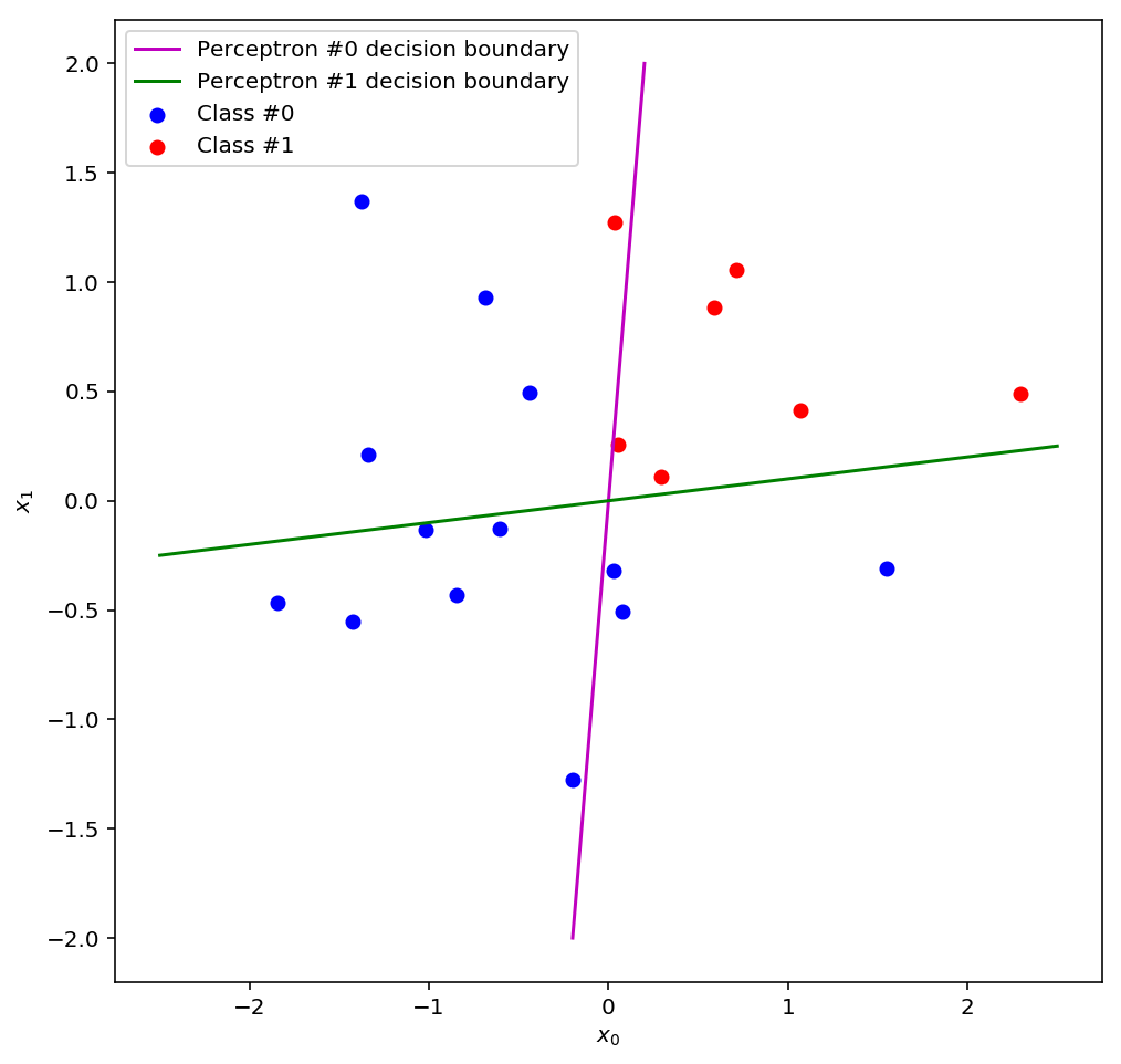
Perceptron #0 classifies everything to the right of the line as 1 and everything to the left as 0, and perceptron #1 classifies everything above the line as 1 and everything below as 0. You can see that on their own, neither perceptron does a very good job of classifying the data, but there is a region, the upper right quadrant, in which they both get most of their predictions correct. If we could somehow combine these decision boundaries we might have a reasonably good classifier…
And this is precisely what a multi-layer perceptron does! We’ve made a second layer that combines the outputs of the first layer (the outputs of perceptrons #0 and #1) to make a better prediction than either classifier in the first layer could have independently come up with.
But as we know, a perceptron is a linear model: the only thing it can do is draw a line through the input space that hopefully separates the data into two classes. This means that if our second layer makes good predictions, the inputs that it received must have been linearly separable (or nearly so). Therefore, we can deduce that the first layer must have performed some kind of transformation on the original data that yielded a new set of data that was linearly separable! A natural question, then, is what exactly do the inputs to the second layer look like? Or, to put it more precisely, what does our input space look like after the first layer has applied its transformation?
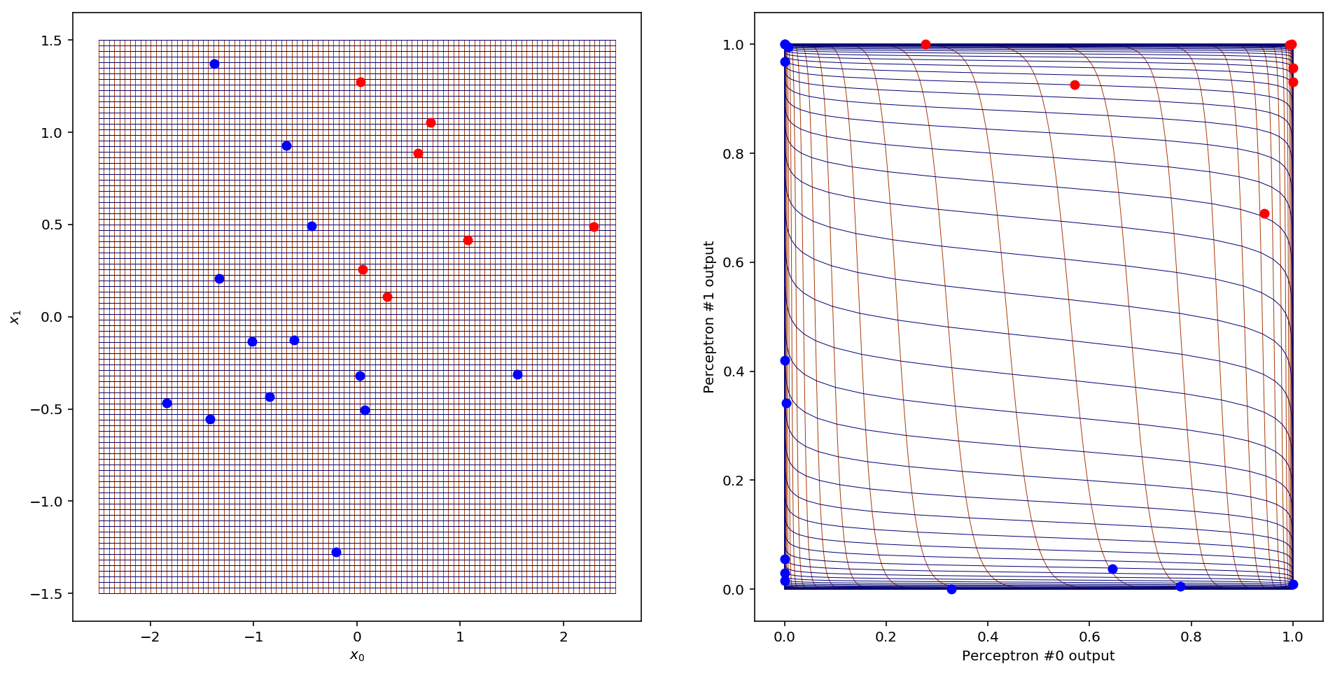
To get an idea of what happens, let’s look at what happens to the gridlines in the input space once they’ve been transformed by the hidden layer:
nl_transform = lambda d: np.apply_along_axis(lambda x: [perceptron(w0, x), perceptron(w1, x)], 1, d)

n_gridlines = 100
gridline_x = np.linspace(-2.5, 2.5, num=n_gridlines)
gridline_y = np.linspace(-1.5, 1.5, num=n_gridlines)

fig = plt.figure(figsize=(16,8))

ax = plt.subplot(1,2,1)
for glx in gridline_x:
    g_t = np.array([np.zeros(n_gridlines) + glx, gridline_y]).T
    ax.plot(g_t[:, 0], g_t[:, 1], color='xkcd:rust', linewidth=0.5, zorder=1)
for gly in gridline_y:
    g_t = np.array([gridline_x, np.zeros(n_gridlines) + gly]).T
    ax.plot(g_t[:, 0], g_t[:, 1], color='xkcd:deep blue', linewidth=0.5, zorder=1)
ax.set_xlabel("$x_0$")
ax.set_ylabel("$x_1$")

ax = plt.subplot(1,2,2)
for glx in gridline_x:
    g_t = nl_transform(np.array([np.zeros(n_gridlines) + glx, gridline_y]).T)
    ax.plot(g_t[:, 0], g_t[:, 1], color='xkcd:rust', linewidth=0.5, zorder=1)
for gly in gridline_y:
    g_t = nl_transform(np.array([gridline_x, np.zeros(n_gridlines) + gly]).T)
    ax.plot(g_t[:, 0], g_t[:, 1], color='xkcd:deep blue', linewidth=0.5, zorder=1)
ax.set_xlabel('Perceptron #0 output')
ax.set_ylabel('Perceptron #1 output')
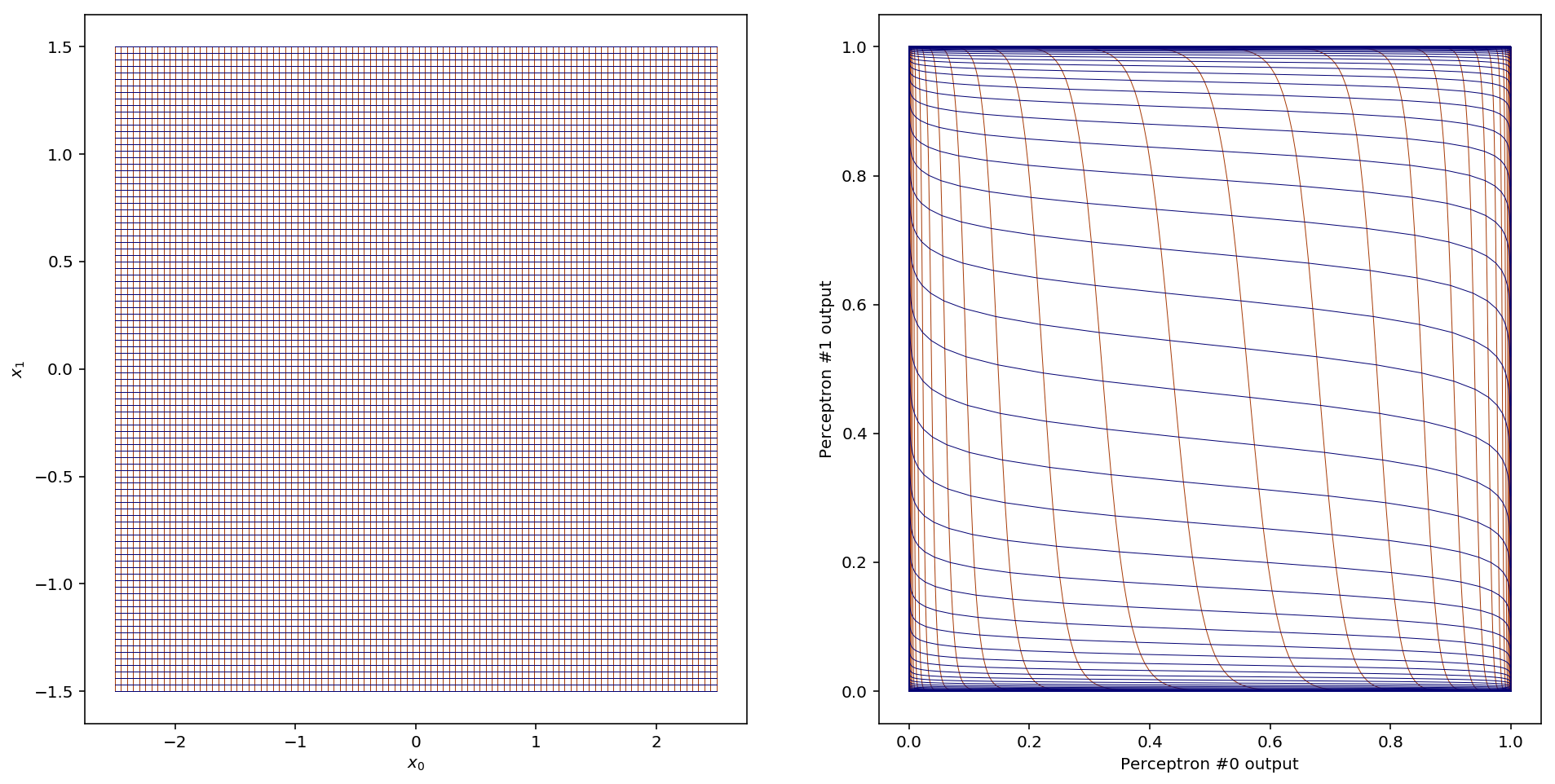
Woah! Here the (vertical) gridlines from the input space are plotted in red and the (horizontal) gridlines are plotted in blue. So what does this tell us? First, notice that the entirety of our two-dimensional space (all of ) has been mapped into a 1x1 square centred on the point (0.5,0.5). This is a consequence of the sigmoid function, which only outputs values between 0 and 1. Most of the new space is filled up with gridlines that were close to the decision boundaries in the input space. All the other gridlines (extending off to in both directions) have been squished up against the sides of the 1x1 square.
So what happened to our data?
nl_transform = lambda d: np.apply_along_axis(lambda x: [perceptron(w0, x), perceptron(w1, x)], 1, d)

data_t = nl_transform(data)
data_t_0 = data_t[label == 0]
data_t_1 = data_t[label == 1]

db0 = nl_transform(np.array([t0, decision_boundary(w0, t0)]).T)
db1 = nl_transform(np.array([t1, decision_boundary(w1, t1)]).T)

fig = plt.figure(figsize=(8,8))
ax = plt.axes()
ax.scatter(data_t_0[:, 0], data_t_0[:, 1], c='b', label='Class #0')
ax.scatter(data_t_1[:, 0], data_t_1[:, 1], c='r', label='Class #1')
ax.plot(db0[:, 0], db0[:, 1], 'm', label='Perceptron #0 decision boundary')
ax.plot(db1[:, 0], db1[:, 1], 'g', label='Perceptron #1 decision boundary')
ax.set_xlabel('Perceptron #0 output')
ax.set_ylabel('Perceptron #1 output')
ax.legend()
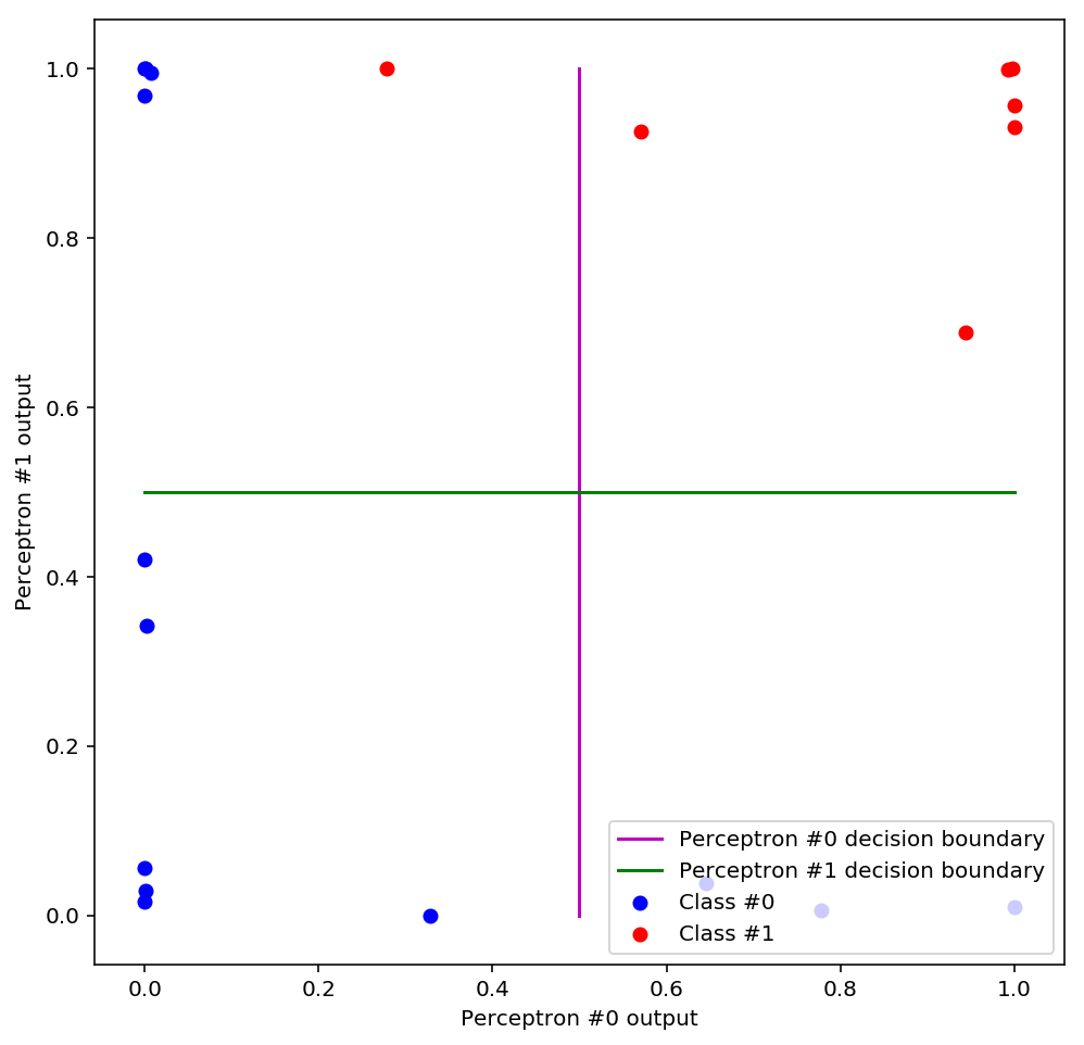
We can immediately see that the data has been squished out to the sides of the plot and is now linearly separable, meaning that a perceptron that used this space as input would be able to draw a linear decision boundary that correctly classifies all the data. Additionally, something interesting has happened to the old decision boundaries: they have become like a set of axes (an orthogonal basis for the space). Could we have guessed that this would happen? It turns out we could have: remember that a decision boundary is just a line along which the perceptron predicts a constant value, called the threshold. For example, if our decision threshold is 0.5 then the decision boundary is the set of points along which the perceptron outputs = 0.5. Now, since the predictions of each perceptron make up the coordinates of our new space, we see the decision boundaries as lines of constant value in each coordinate positioned at the decision threshold.
Let’s see the data and the gridlines together:
n_gridlines = 100
gridline_x = np.linspace(-2.5, 2.5, num=n_gridlines)
gridline_y = np.linspace(-1.5, 1.5, num=n_gridlines)

fig = plt.figure(figsize=(16,8))

ax = plt.subplot(1,2,1)
for glx in gridline_x:
    g_t = np.array([np.zeros(n_gridlines) + glx, gridline_y]).T
    ax.plot(g_t[:, 0], g_t[:, 1], color='xkcd:rust', linewidth=0.5, zorder=1)
for gly in gridline_y:
    g_t = np.array([gridline_x, np.zeros(n_gridlines) + gly]).T
    ax.plot(g_t[:, 0], g_t[:, 1], color='xkcd:deep blue', linewidth=0.5, zorder=1)
ax.scatter(data_0[:, 0], data_0[:, 1], c='b', label='Class #0', zorder=2)
ax.scatter(data_1[:, 0], data_1[:, 1], c='r', label='Class #1', zorder=2)
ax.set_xlabel("$x_0$")
ax.set_ylabel("$x_1$")

ax = plt.subplot(1,2,2)
for glx in gridline_x:
    g_t = nl_transform(np.array([np.zeros(n_gridlines) + glx, gridline_y]).T)
    ax.plot(g_t[:, 0], g_t[:, 1], color='xkcd:rust', linewidth=0.5, zorder=1)
for gly in gridline_y:
    g_t = nl_transform(np.array([gridline_x, np.zeros(n_gridlines) + gly]).T)
    ax.plot(g_t[:, 0], g_t[:, 1], color='xkcd:deep blue', linewidth=0.5, zorder=1)
ax.scatter(data_t_0[:, 0], data_t_0[:, 1], c='b', label='Class #0', zorder=2)
ax.scatter(data_t_1[:, 0], data_t_1[:, 1], c='r', label='Class #1', zorder=2)
ax.set_xlabel('Perceptron #0 output')
ax.set_ylabel('Perceptron #1 output')
Now it’s easy to see why all the data has become concentrated around the edges: that’s where the gridlines went too! We can think of this as a kind of fish-eye effect: the new space magnifies the parts of the old space which were adjacent to the decision boundaries (like the middle of a fish-eye lens) and pushes everything else out of the way. Why does this work for training neural networks? Loosely, you can think of the space around the decision boundaries as the most “interesting” parts of the data: it’s the space that the two perceptrons in the first layer are least confident about classifying, so it makes sense to enhance our view of that part of the space. A perceptron is more confident in its predictions the farther you get from its decision boundary, so the space far away from a decision boundary is boring and predictable, and we can safely ignore it.
In the abstract, we can think of this effect as being the result of some transformation applied to the input space, which just so happens to be useful for classifying the data 1. One of the best ways to understand a transformation is to play with it. In our case, the transformation is computed by the hidden layer perceptrons, and so there are 4 parameters to play with: and control the first perceptron, and and control the second. What happens when you change the weights of the hidden layer? Can you find other values for the weights that also yield linearly separable data? Try it out for yourself:
There is a lot you can learn from playing with these perceptrons, so I’ll just point out one interesting observation. You may have noticed that, in general, the bigger you make the weights (in absolute value) the “sharper” the fish-eye effect. In other words, the gridlines in the center of the space get more spread out and everything else gets even more squished up against the sides of the square. This reflects the fact that larger weights cause the sigmoid to sharpen and become more like a step function.
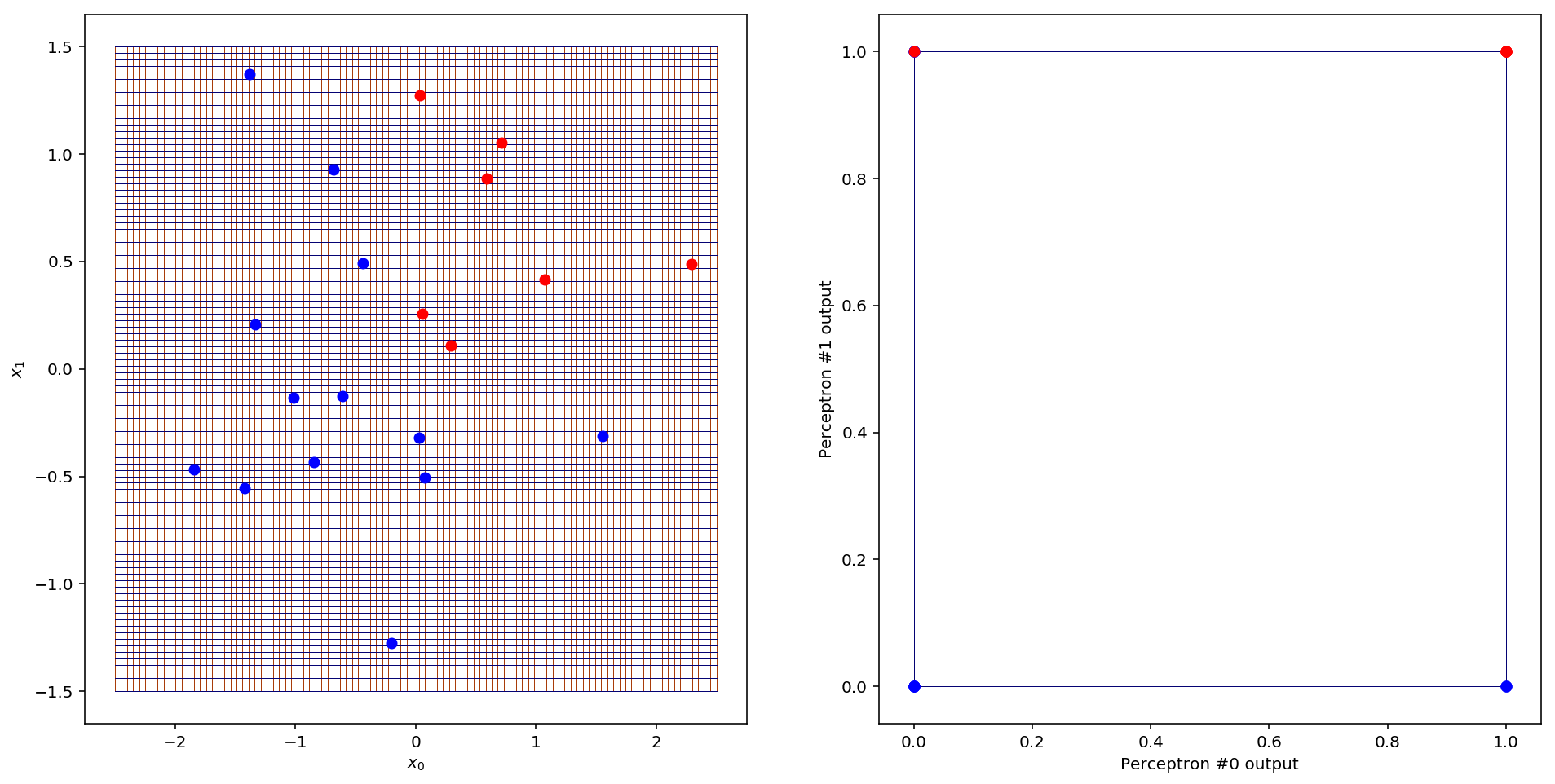
Notice also that the gridlines are all S-shaped, like the sigmoid curve (which owes its name to its peculiar S-shape). In fact, this is a consequence of using the sigmoid as the activation function. So does this nice “fish-eye” transformation depend on our choice of activation function? Let’s consider what would happen if we instead used a step function as the activation. Since the step function outputs only 0 or 1 for any input, every point in the input space would be mapped to one of four points in the new space: (0,0), (1,0), (0,1) and (1,1), the corners of the unit square. These correspond to the four possible output combinations of the two perceptrons in the first layer. Here’s what that looks like:
def step(x):
    return 0 if x <= 0 else 1

def perceptron_step(weights, x):
    return step(np.dot(x, weights))

nl_transform_step = lambda d: np.apply_along_axis(lambda x: [perceptron_step(w0, x), perceptron_step(w1, x)], 1, d)

data_t_step = nl_transform_step(data)
data_t_step_0 = data_t_step[label == 0]
data_t_step_1 = data_t_step[label == 1]

n_gridlines = 100
gridline_x = np.linspace(-2.5, 2.5, num=n_gridlines)
gridline_y = np.linspace(-1.5, 1.5, num=n_gridlines)

fig = plt.figure(figsize=(16,8))

ax = plt.subplot(1,2,1)
for glx in gridline_x:
    g_t = np.array([np.zeros(n_gridlines) + glx, gridline_y]).T
    ax.plot(g_t[:, 0], g_t[:, 1], color='xkcd:rust', linewidth=0.5, zorder=1)
for gly in gridline_y:
    g_t = np.array([gridline_x, np.zeros(n_gridlines) + gly]).T
    ax.plot(g_t[:, 0], g_t[:, 1], color='xkcd:deep blue', linewidth=0.5, zorder=1)
ax.scatter(data_0[:, 0], data_0[:, 1], c='b', label='Class #0', zorder=2)
ax.scatter(data_1[:, 0], data_1[:, 1], c='r', label='Class #1', zorder=2)
ax.set_xlabel("$x_0$")
ax.set_ylabel("$x_1$")

ax = plt.subplot(1,2,2)
for glx in gridline_x:
    g_t = nl_transform_step(np.array([np.zeros(n_gridlines) + glx, gridline_y]).T)
    ax.plot(g_t[:, 0], g_t[:, 1], color='xkcd:rust', linewidth=0.5, zorder=1)
for gly in gridline_y:
    g_t = nl_transform_step(np.array([gridline_x, np.zeros(n_gridlines) + gly]).T)
    ax.plot(g_t[:, 0], g_t[:, 1], color='xkcd:deep blue', linewidth=0.5, zorder=1)
ax.scatter(data_t_step_0[:, 0], data_t_step_0[:, 1], c='b', label='Class #0', zorder=2)
ax.scatter(data_t_step_1[:, 0], data_t_step_1[:, 1], c='r', label='Class #1', zorder=2)
ax.set_xlabel('Perceptron #0 output')
ax.set_ylabel('Perceptron #1 output')
What this means is that for each input data point, the second layer perceptron will receive one of those four corners as input and can use only that information to decide how to classify the point. This reduces the problem to a statistical average problem: what fraction of points in each corner belong to each class? We can conclude that if we were to use step activation, lots of information would certainly be lost, and thus sigmoid activation seems better. On the other hand, it is definitely possible for a two layer perceptron to achieve good accuracy on this particular data set even using step activation. There are many factors that can influence what activation function you choose, and the default choice as of this moment tends to be something called a rectified linear unit, or ReLU 2. I chose to play with the sigmoid activation because it produces pretty visualisations and incidentally was one of the earliest functions used.
Ok, where are we now? Our hidden layer perceptrons found a non-linear transformation of the input space that yields a new space in which the data is more linearly separable than before. In this new space, we can easily eyeball a linear solution to the above classification, and a perceptron should have no trouble finding it either. Here’s one possible solution:
def decision_boundary_bias(weights, bias, x0):
    return -1. * (weights[0]/weights[1] * x0 + bias/weights[1])

fig = plt.figure(figsize=(8,8))
ax = plt.axes()

t2 = np.linspace(0.2, 1, num=50)
w2 = np.array([1,1])
b2 = -1.2

ax.scatter(data_t_0[:, 0], data_t_0[:, 1], c='b', label='Class #0')
ax.scatter(data_t_1[:, 0], data_t_1[:, 1], c='r', label='Class #1')
ax.plot(t2, decision_boundary_bias(w2, b2, t2), color='xkcd:chocolate', label='Perceptron #2 decision boundary')
ax.set_xlabel('Perceptron #0 output')
ax.set_ylabel('Perceptron #1 output')
ax.legend()
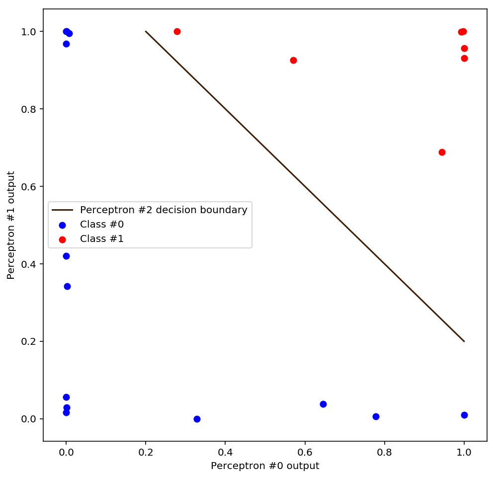
We can visually verify that this final decision boundary will correctly classify all the points in the transformed space. What will this line have to look like in the input space? Scroll back up and take a look at how the data is laid out: the final decision boundary definitely can’t be a straight line! In fact it’s going to have to be very curved, pulling a tight right-angle turn near the point (0,0). We can visualise the final decision boundary by inverting the non-linear transformation that we applied to the data:
def logit(x):
    # Logit is the inverse of the sigmoid
    return np.log(x / (1. - x))

def perceptron_bias(weights, bias, x):
    return sigmoid(np.dot(weights, x) + bias)

wt = np.array([w0, w1])
wt_inv = np.linalg.inv(wt)
nl_transform_inv = lambda d: np.apply_along_axis(lambda o: np.matmul(wt_inv, logit(o)), 1, d)

t2 = np.linspace(0, 1, num=100000)
db2 = nl_transform_inv(np.array([t2, decision_boundary_bias(w2, b2, t2)]).T)

fig = plt.figure(figsize=(8,8))
ax = plt.axes()
ax.scatter(data_0[:, 0], data_0[:, 1], c='b', label='Class #0')
ax.scatter(data_1[:, 0], data_1[:, 1], c='r', label='Class #1')
ax.plot(t0, decision_boundary(w0, t0), 'm', label='Perceptron #0 decision boundary')
ax.plot(t1, decision_boundary(w1, t1), 'g', label='Perceptron #1 decision boundary')
ax.plot(db2[:, 0], db2[:, 1], color='xkcd:chocolate', label='Perceptron #2 decision boundary')
ax.set_xlabel("$x_0$")
ax.set_ylabel("$x_1$")
ax.legend()
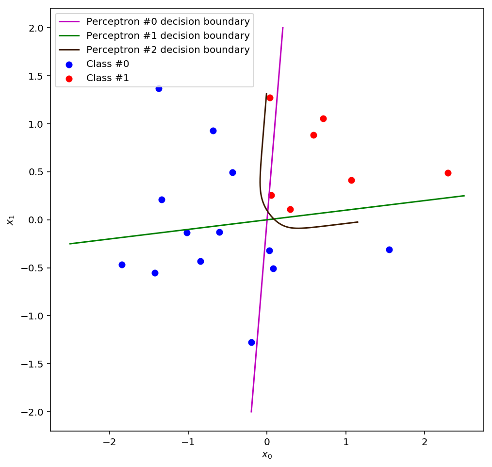
I’ve also plotted the original decision boundaries so that you can compare them with the final decision boundary. From this vantage point, it’s clear that the final decision boundary is something like a weighted blend of the two boundaries from the first layer. This “blending” idea is usually the way people talk about multi-layer perceptrons, but to me it’s a little unsatisfying 3. It is hard to intuitively see how such a simple algorithm could be smart enough to figure out a way to shape and position this tricky curved decision boundary that separates the data in the input space. But if we look at what the perceptron in the second layer is actually “seeing”, it’s clear that it only has to solve the same problem that perceptrons always solve: find a line in space that separates the data. The space has changed, not the algorithm.
Alright, one last visualisation to complete the picture. The plot above shows the decision boundary of the final perceptron, which is really just a contour line along which it predicts a constant = 0.5. However, when building a predictive model you have the flexibility of choosing any activation threshold you want for the decision boundary. So what do the other contour lines look like in the original input space?
def perceptron_contour(weights, bias, x, y):
    return sigmoid(weights[0]*x + weights[1]*y + bias)

fig = plt.figure(figsize=(8,8))
ax = plt.axes()

x = np.linspace(-2.5, 2.5, num=200)
y = np.linspace(-1.5, 1.5, num=200)
X, Y = np.meshgrid(x, y)
Z = perceptron_contour(w2, b2, perceptron_contour(w0, 0, X, Y), perceptron_contour(w1, 0, X, Y))
contours = np.linspace(0.1,0.9, num=21)
cs = ax.contour(X, Y, Z, contours, linewidths=0.5)
plt.clabel(cs, inline=1, fontsize=10, fmt='%1.2f')

ax.scatter(data_0[:, 0], data_0[:, 1], c='b', label='Class #0')
ax.scatter(data_1[:, 0], data_1[:, 1], c='r', label='Class #1')

ax.set_xlabel("$x_0$")
ax.set_ylabel("$x_1$")

ax.legend()
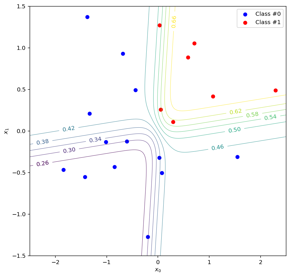
Here you can see the = 0.5 decision boundary as before, along with a range of other possible choices. Note that in this scenario, everything above and to the right of a given boundary would be classified as class #1, and everything else as class #0. In the transformed space, these lines correspond to straight lines parallel to the decision boundary of the final perceptron.
To summarise what we have found: the perceptrons in the hidden layer of the neural network created a non-linear transformation that yielded a new space. This new space made the data easier to classify by zooming in on the areas of low confidence around the decision boundaries in the input space. The perceptron in the output layer effectively gets to work at higher magnification in the new space, and so it should be able to achieve better accuracy than any of the perceptrons in the hidden layer. Now imagine stacking layer upon layer of perceptrons in this manner, iteratively finding new transformations that zoom in further and further on the most difficult parts of the dataset, and you can begin to feel how complex the final decision boundary might become. And since we have algorithms for training perceptrons, they can find these transformation by themselves. I think that’s amazing, and it gets at the heart of what machine learning with neural networks really is: it’s not some magical black box hack, nor is it necessarily a simulation of brain activity. It’s a principled system for finding non-linear transformations that make the data easier to work with.
-
For a great introduction to the mathematics of transformations, I highly recommend 3Blue1Brown’s video series on the Essence of Linear Algebra. ↩
-
Goodfellow et al. (2016) - Deep Learning - Chapter 6, p. 171 - The MIT Press - www.deeplearningbook.org - Accessed Dec. 2017 ↩
-
As an aside, if you take the blending analogy further then another way to think about a multi-layer perceptron is as a kind of ensemble method. An ensemble method is a technique for taking predictions from a bunch of lousy models and producing a kind of weighted average that is more correct more often than any of the individual models. One example is something called a random forest, where you create a group of decision trees, train each one on only a small subset of the data, and then use the trees’ collective predictions as a “vote” to decide how to classify each point. Another example is a technique called boosting (the idea behind AdaBoost), in which you train successive models on the data where the previous model made the most mistakes. In our case, we can think of the first layer of the perceptron as an ensemble of lousy perceptrons, except instead of just voting or averaging classifiers, we also do something a little like boosting: we focus in on the areas where the ensemble is least confident and train new models on those regions. ↩